Carnegie Museum of Art
Connecting people to art, ideas, and one another.
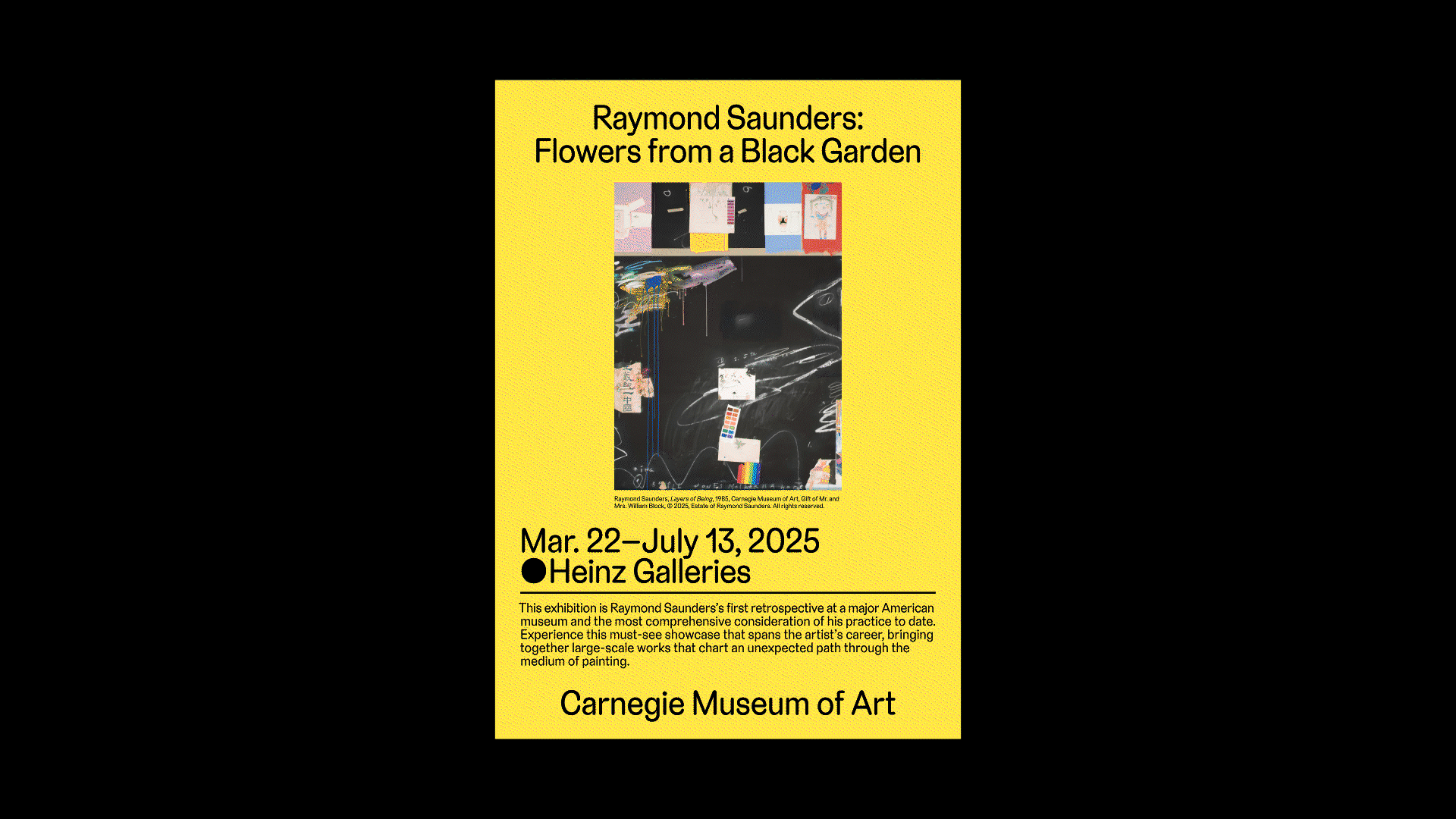
My work at the Carnegie Museum of Art focuses on making exhibitions and programs accessible and engaging for the public through bold visual identities, printed pieces, and digital assets. Here’s a look at a few projects I was a part of where I shaped the visual language and helped bring curatorial ideas to life.
Team
Brette Richmond, Associate Director of Design and Publishing
Zachary Riggleman, Photography Manager
Shaheen Qureshi, Associate Editor
Erin Barnhart, Design and Publishing Studio Manager
Brette Richmond, Associate Director of Design and Publishing
Zachary Riggleman, Photography Manager
Shaheen Qureshi, Associate Editor
Erin Barnhart, Design and Publishing Studio Manager
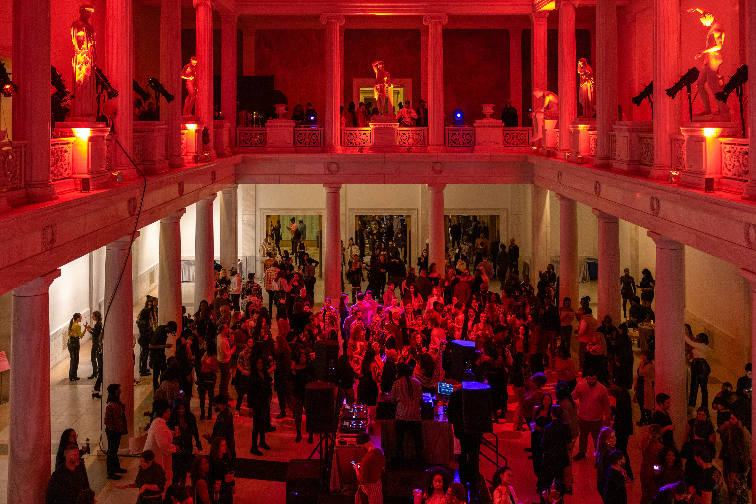
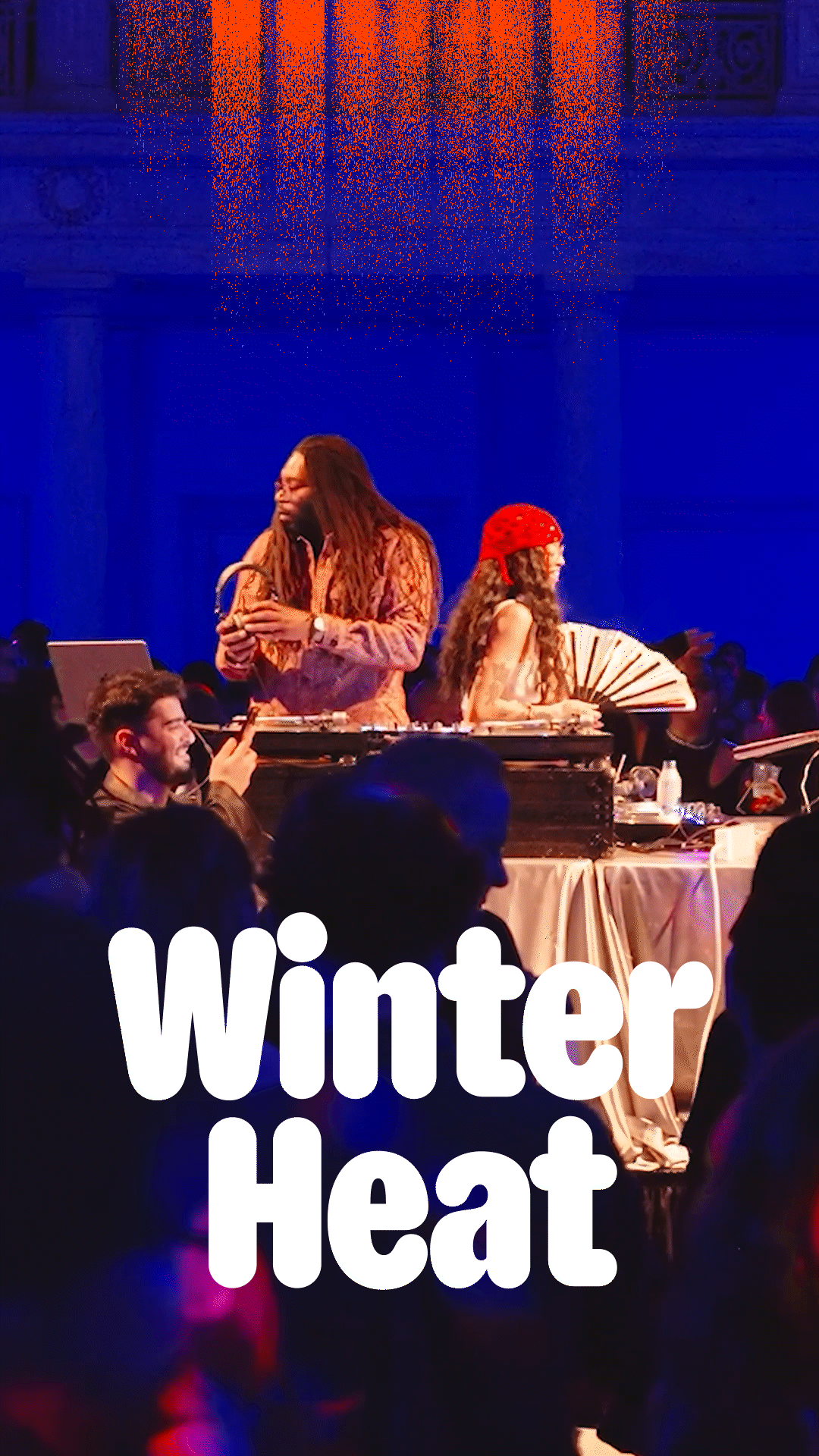
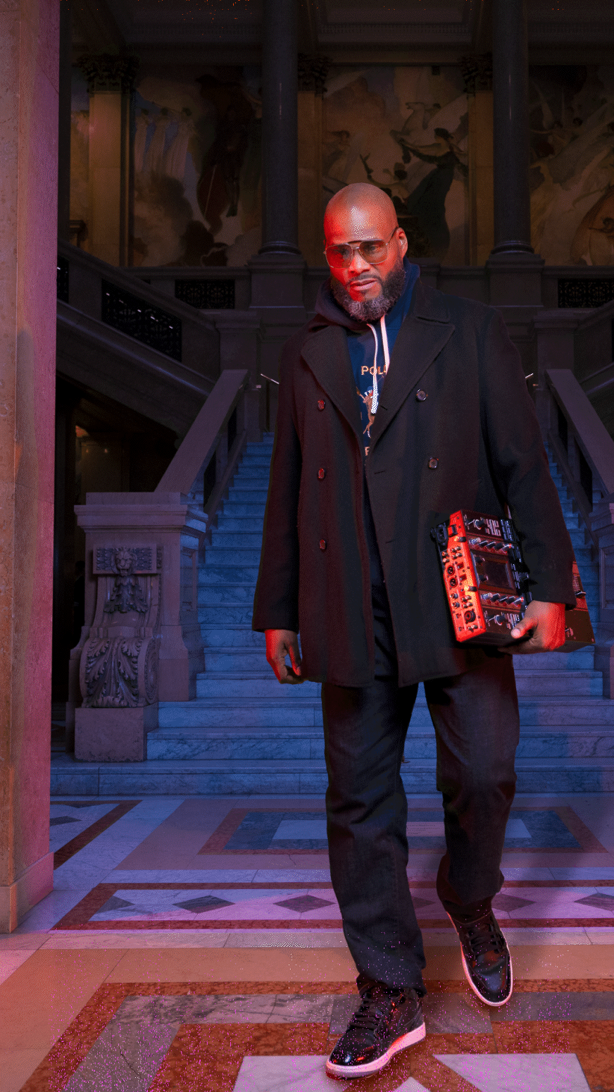
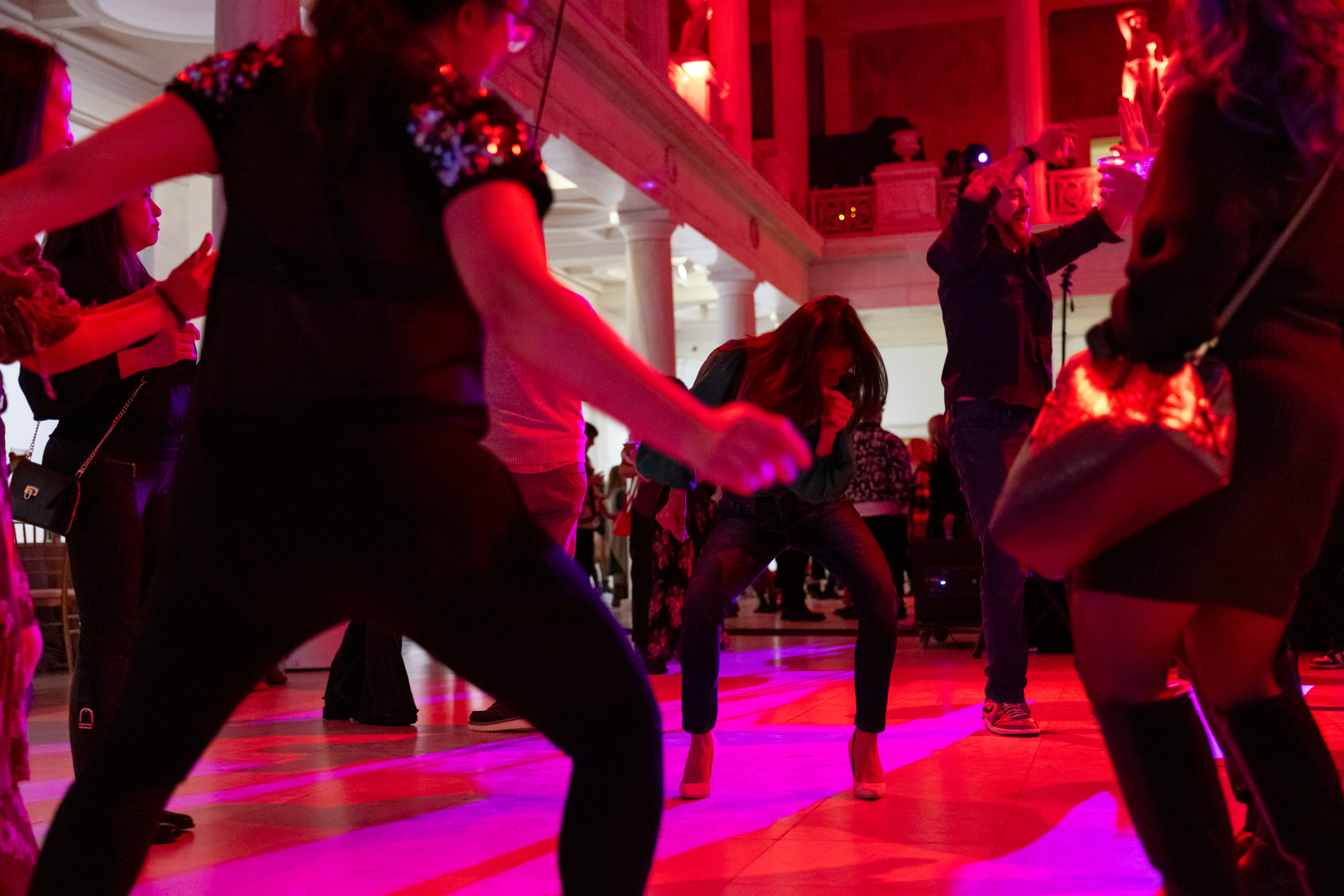
Winter Heat
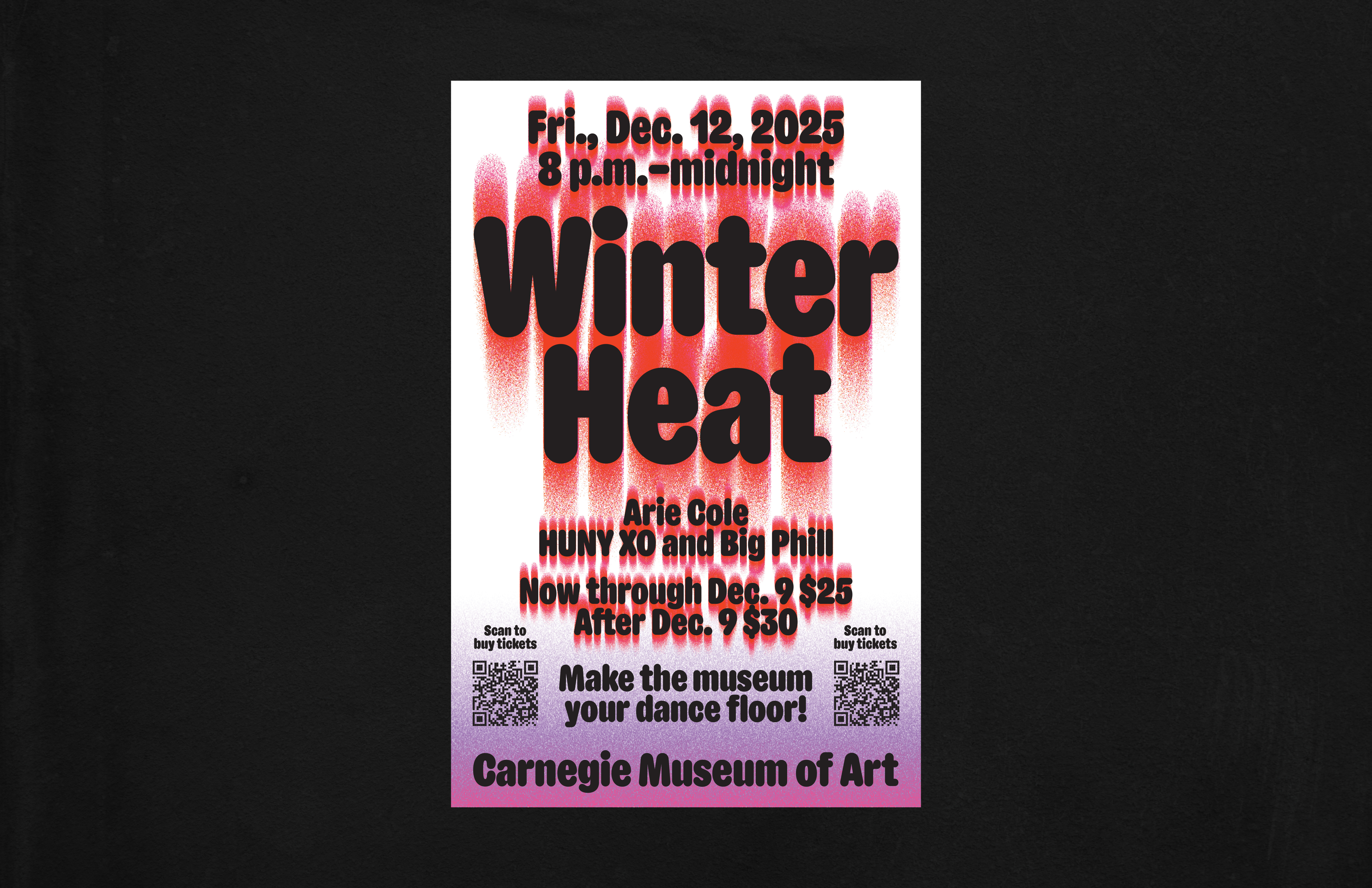
A cold night, a hot party. With late-night gallery hours and DJs lighting up the Hall of Sculpture, this annual event radiates energy. The identity channels that heat through bold color and layered textures drawn from the event’s dramatic lighting.


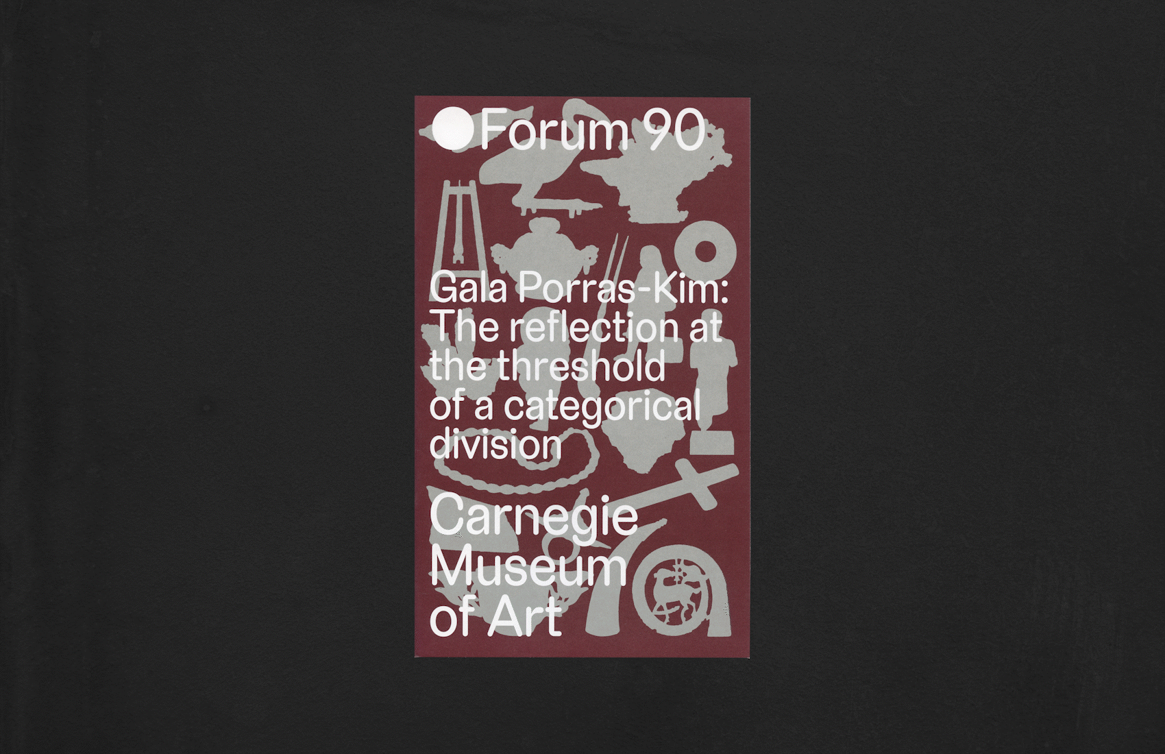
Gala drew inspiration from what she called the “dredges” of the museum’s collection—objects that often remain overlooked or undervalued. Together, we were guided by the distinctive forms and presences of these pieces. To echo this sensibility, I chose silver ink for the brochure and wall text, a color that suggests reflection, both literal and conceptual. The deep red grounds the design in a sense of power and authority, evoking associations with monarchy and ritual, while also highlighting the layered histories embedded in the objects.


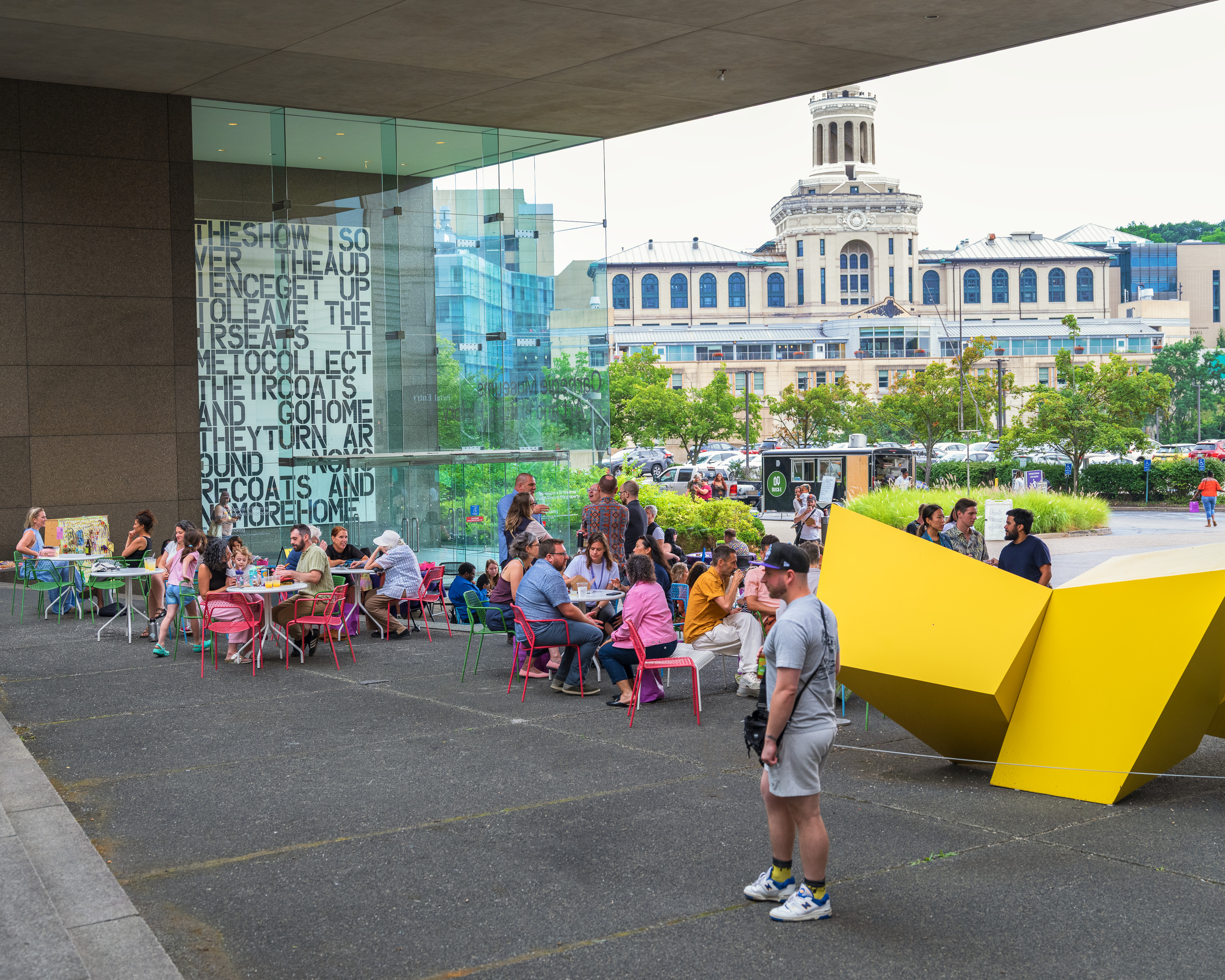
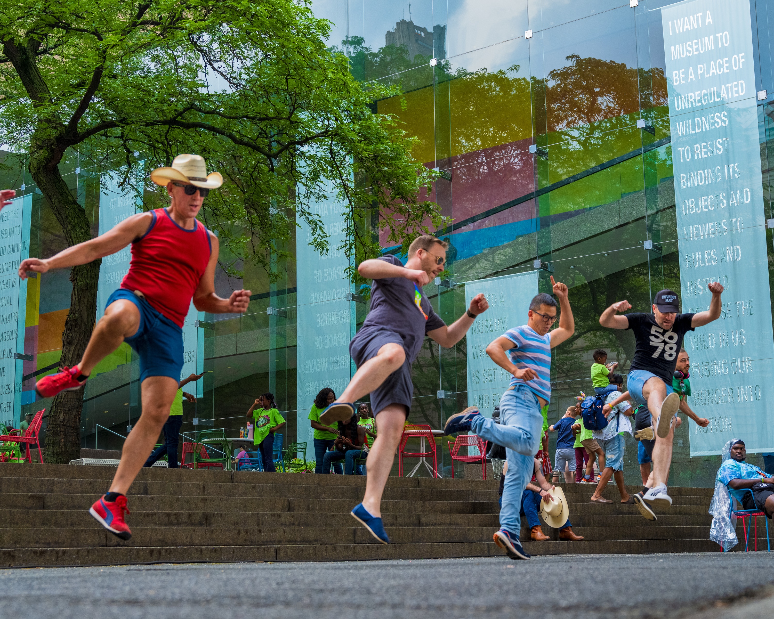
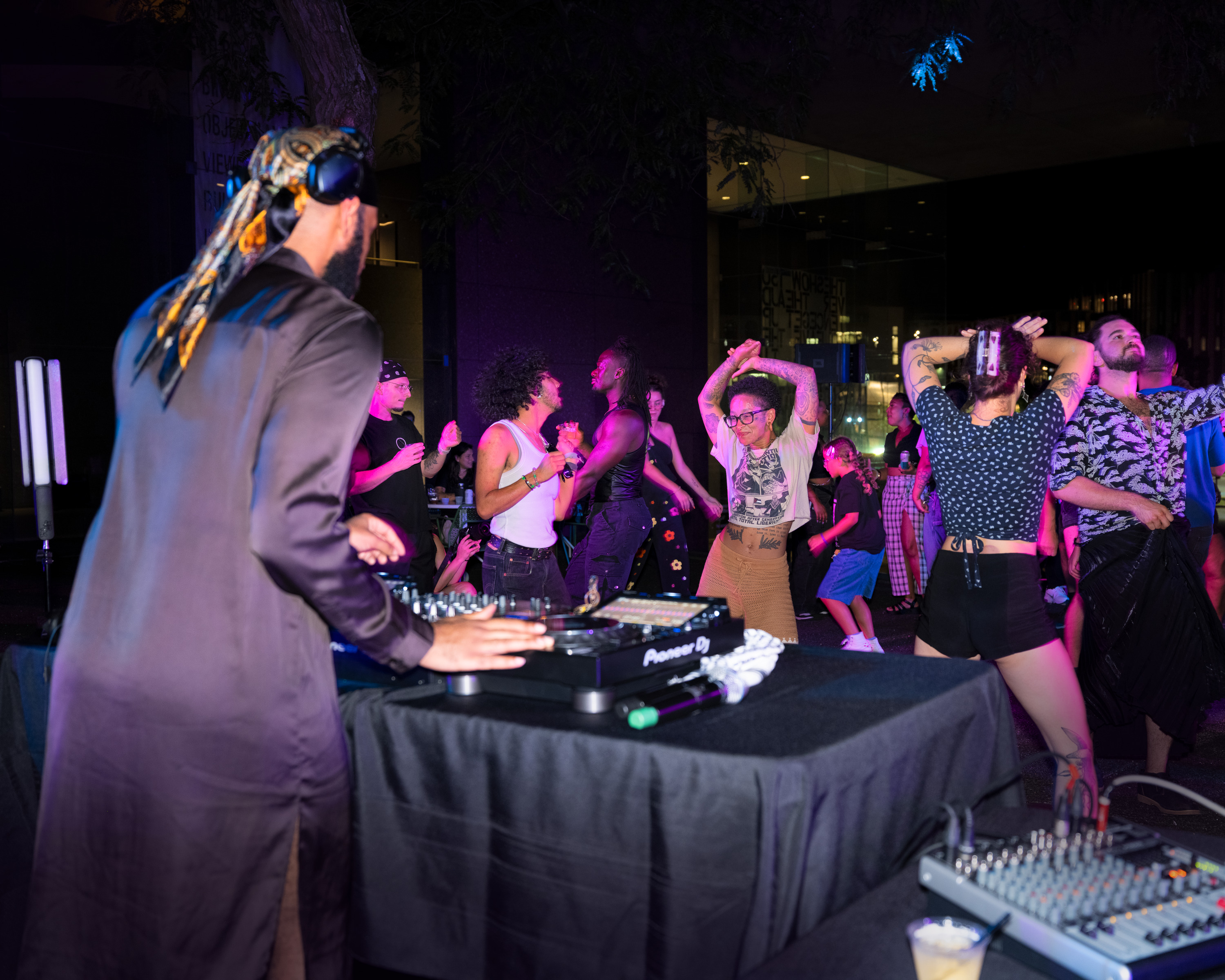
Parties all summer long in the Sculpure Court


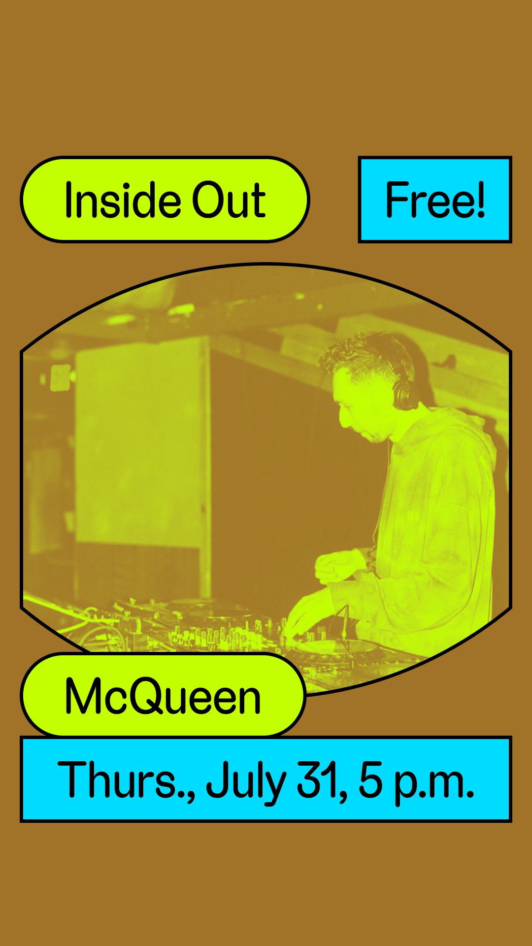
Inside Out is Carnegie Museum of Art’s free summer performance and music series, originally established in 2021. For its fourth season, I expanded the program’s visual language through new, bold, and playful shapes that emphasize motion, activation, and movement. Designed primarily for social media, these assets invited the community into a space for celebration and connection, centering queer and marginalized voices while reflecting the energy and joy of the weekly gatherings.


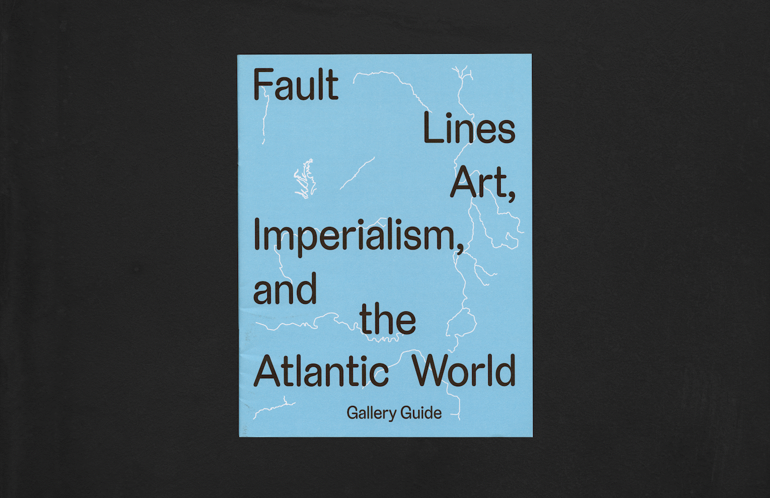
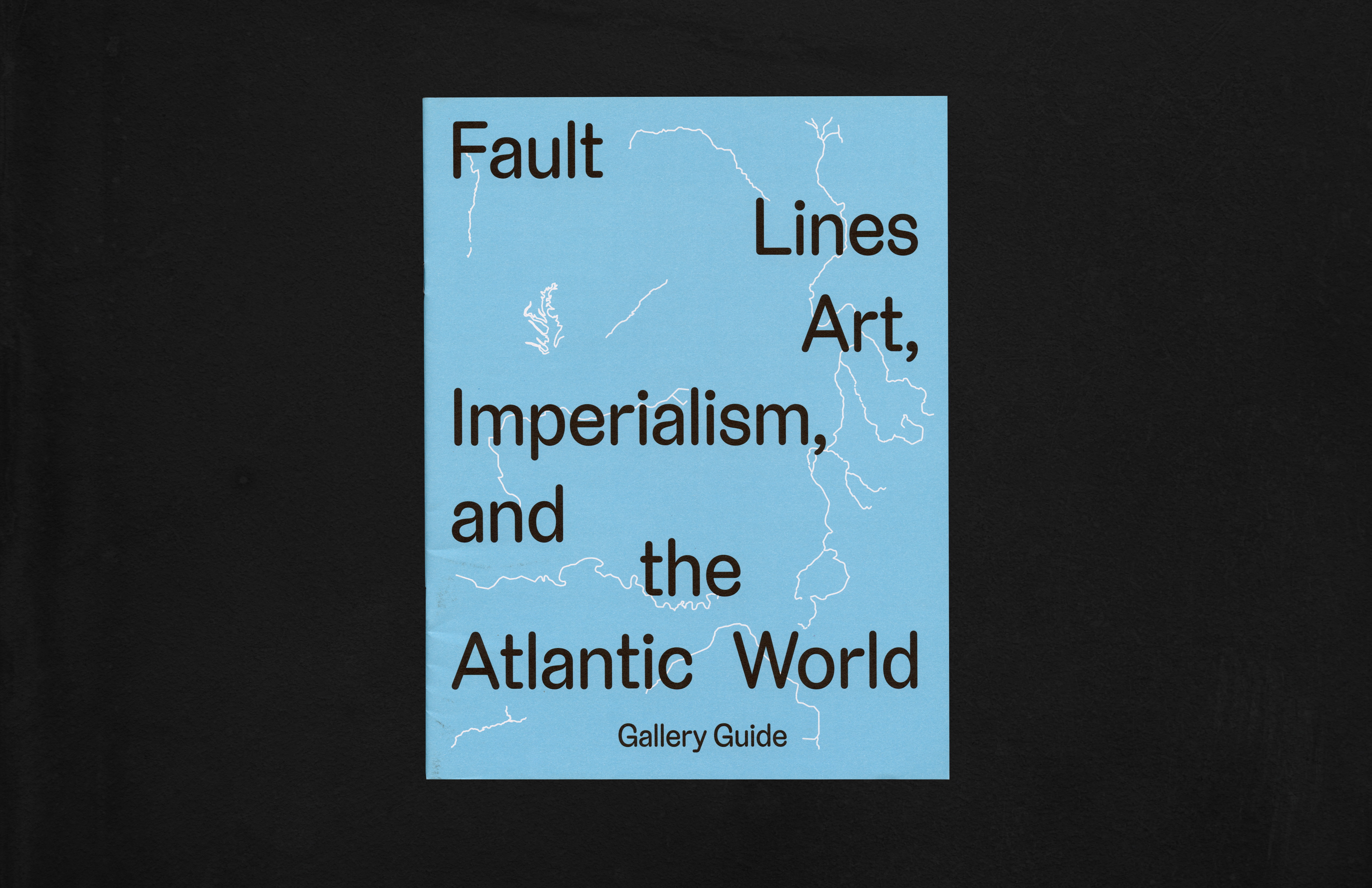
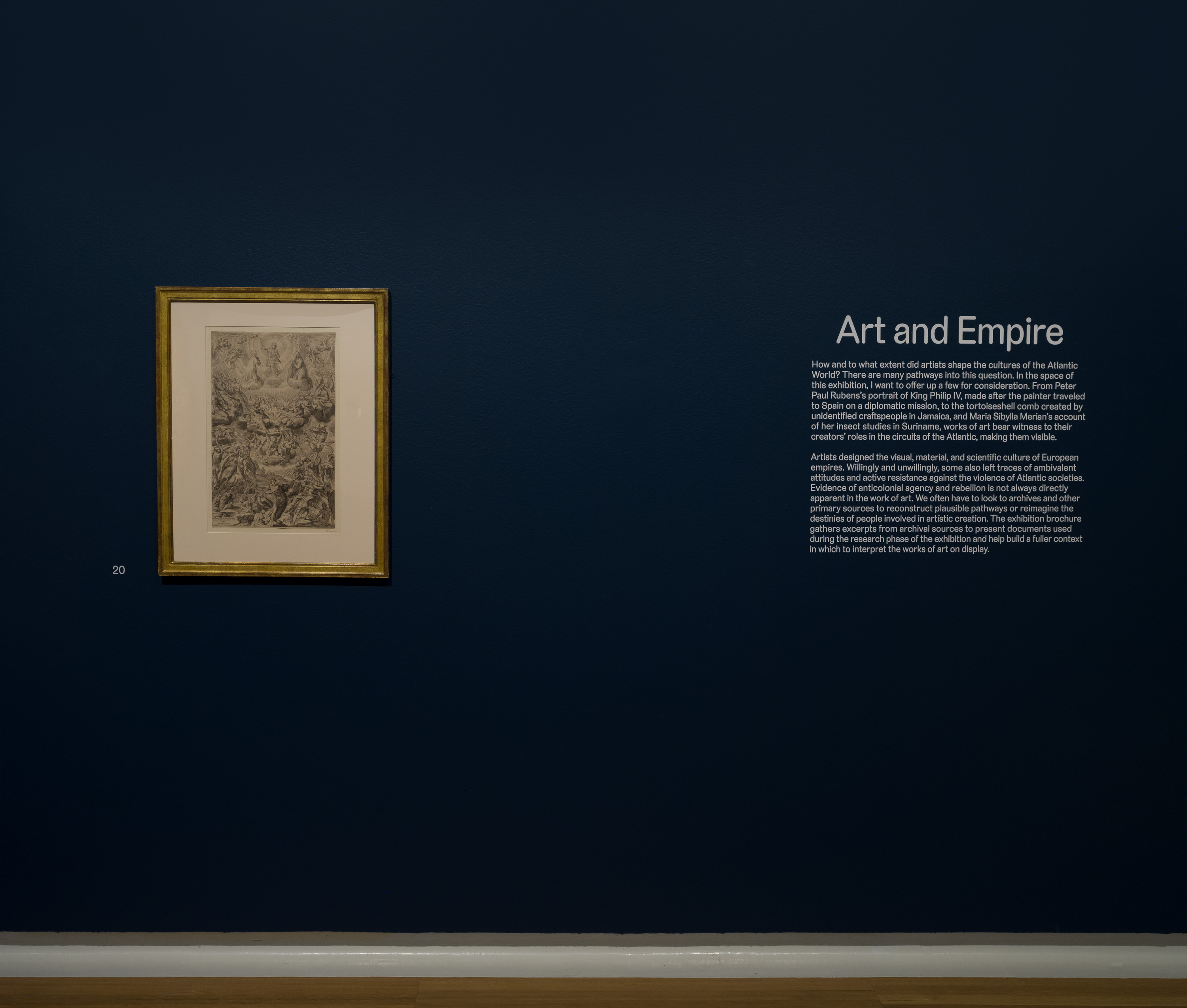
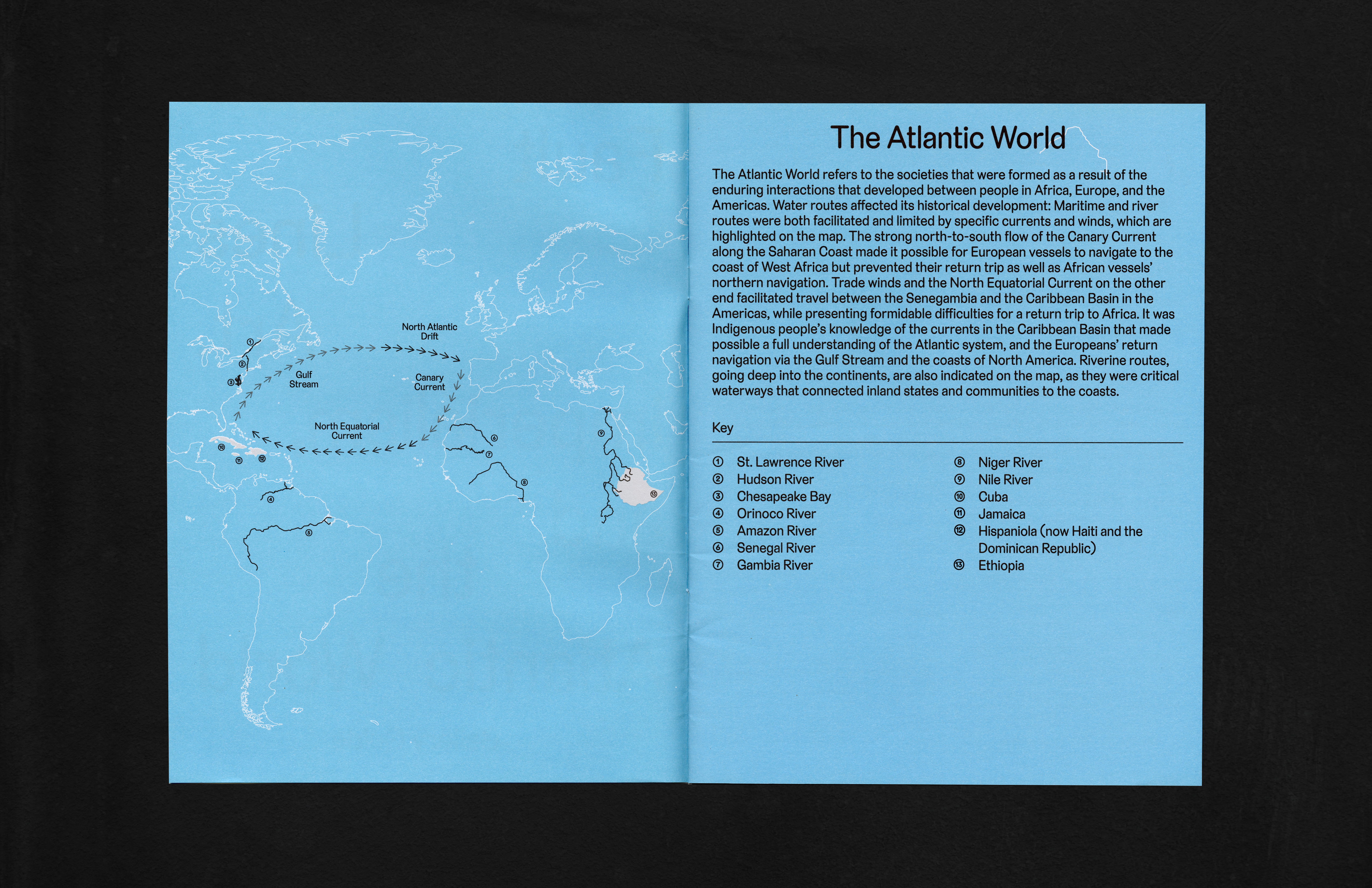
For Fault Lines, I drew from the exhibition’s focus on the entangled histories of the Atlantic World. I used river forms on the gallery guide and wall text to signify both natural boundaries and conceptual “faults” between European and Caribbean worldviews. This visual language echoes the exhibition’s exploration of art, empire, and the ruptures within cultural exchange.


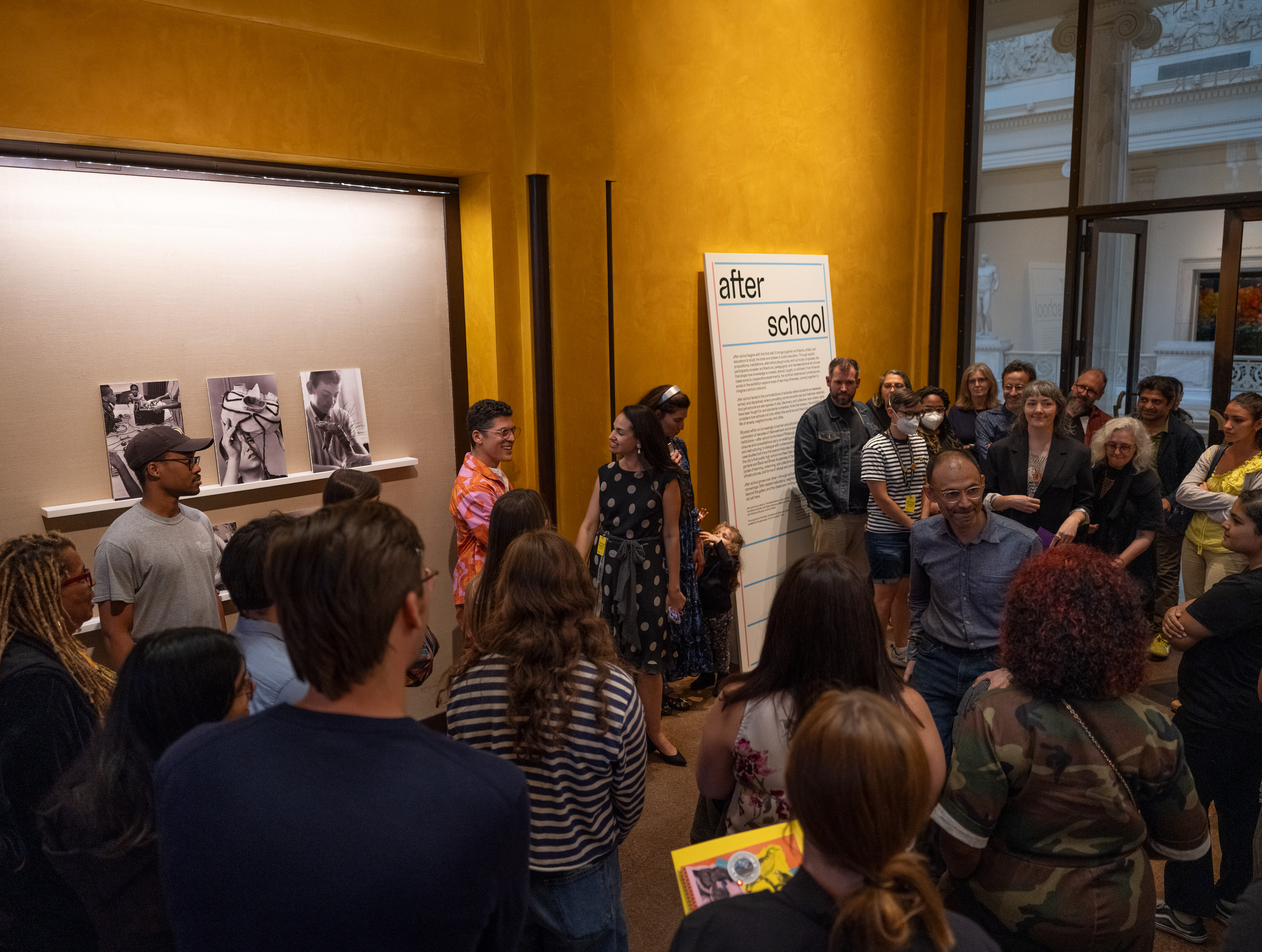
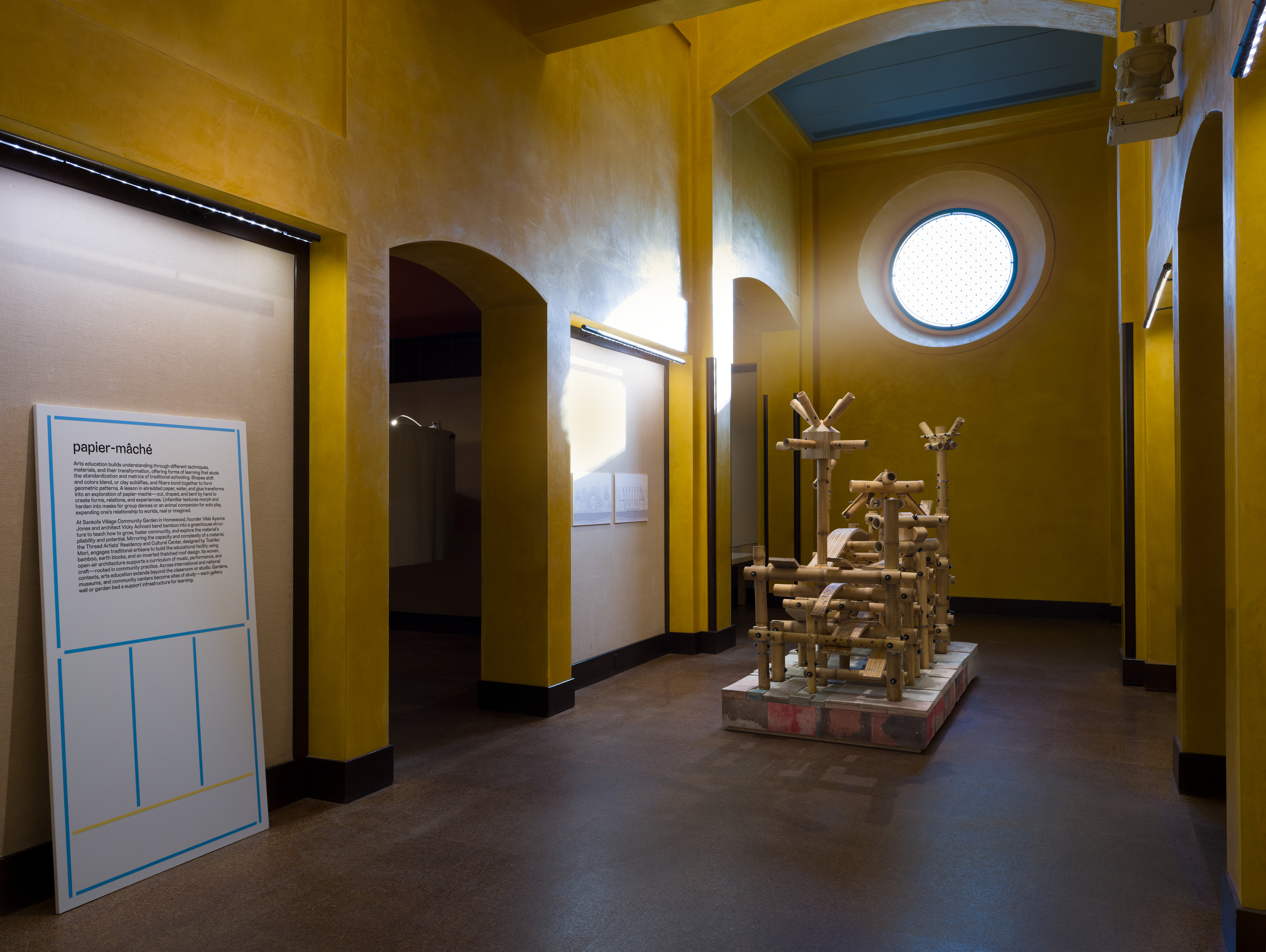
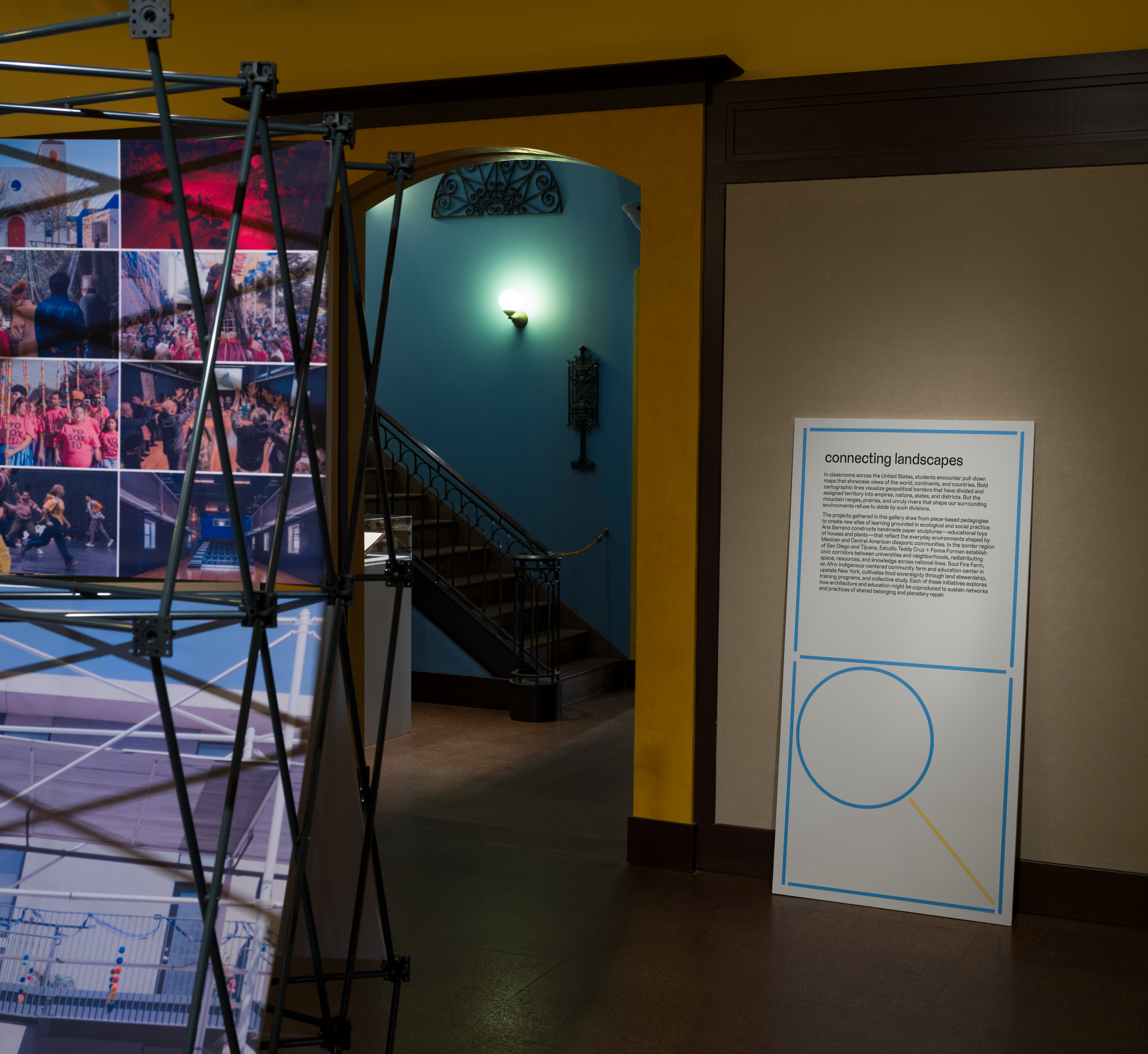
For after school, I drew from objects traditionally tied to classrooms, like magnifying glasses, notebook paper, and erasers. I abstracted them into forms suggesting building blocks and architecture. This visual approach reflects the exhibition’s focus on the structures that shape education: from the physical design of schools to the systems, metrics, and histories that organize how knowledge is created, shared, and contested.


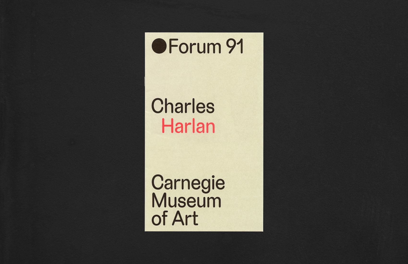
Charles Harlan drew from the dual nature of fire as both warmth and destruction. In this show, this is epitomized in the form of a brick chimney. The layout and structure of the design in the brochure echo the stacking of bricks. More broadly, the approach reflects Harlan’s recurring interest in the industrial, agricultural, and domestic aspects of the built environment. A palette of warm gray and red underscores the tension and dialogue between the industrial and the natural.


All exhibition and event photography courtesy of Zachary Riggleman